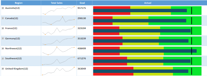
In this module you will learn how to use the VitaraCharts – MicroChart. The VitaraCharts – MicroChart provides a intuitive way to look at multiple metrics in a compact grid layout.
Module 95 – VitaraCharts – MicroChart
Downloads
- Power BI Custom Visual – VitaraCharts – MicroChart
- Dataset – Region Sales Goals.xlsx
- Completed Example – Module 95 – VitaraCharts – MicroChart.pbix
Key Takeaways
- Provide an intuitive way to look at multiple metrics in a compact grid layout.
- Each metric in layout can be presented as a different visual that best serves to convey its meaning.
This MicroChart example shows the total sales by region in a line chart with a bullet chart displaying those regions that reached their goal.
Under the Format paintbrush there isn’t anything that you can specifically change for this visual.
You can however adjust the background color, add a border around the visual and lock the aspect ratio under the Format section.
Find Out More
You will always be able to find this video module and advanced viewing of future modules on the Pragmatic Works On Demand Training platform. Click here to learn more about this training platform that includes 30+ courses.
Catch up on all the Power BI Custom Visuals blog posts here.

