In this module you will learn how to use the Enlighten Data Story. The Enlighten Data Story allows you to tell a simple story with your data while emphasizing your measure values dynamically.
Module 97 – Enlighten Data Story)
Downloads
- Power BI Custom Visual – Enlighten Data Story
- Dataset – Disability Insurance Applications.xlsx
- Completed Example – Module 97 – Enlighten Data Story.pbix
Key Takeaways
- Tells a simple story with your data.
- Displays text with stand-out dynamic values from your data.

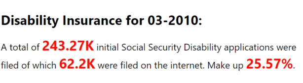
This Enlighten Data Story shows the amount of Social Security Disability Insurance applications that were filed online.
Under the Format paintbrush you will find there are a few settings that are specific to this visual.
- In the Story section you can modify the appearance of the text and modify what the text should show. The default behavior is that anywhere a # sign appears it’s replaced with what’s in your dataset. Multiple # signs will go to the next field in the values list.

- Using the Data section you can change the character that’s replaced from the default # sign. You can also adjust the appearance of the measure values displayed.

You can also adjust the background color, add a border around the visual and lock the aspect ratio under the Format section.
Find Out More
You will always be able to find this video module and advanced viewing of future modules on the Pragmatic Works On Demand Training platform. Click here to learn more about this training platform that includes 30+ courses.
Catch up on all the Power BI Custom Visuals blog posts here.
