In this module you will learn how to use the Heat Streams Custom Visual. The Heat Streams visual allows you to visualize and compare a categorical value over time.
Module 73 – Heat Streams
Downloads
- Power BI Custom Visual – Heat Streams
- Dataset – Monthly Sales by State.xlsx
- Completed Example – Module 73 – Heat Streams.pbix
Key Takeaways
- Visualize and compare categorical values over time.
- Has Sequential, Divergent and Categorical color schemes available.

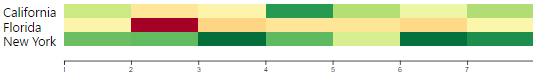
This Heat Streams visual displays the performance of each state by month.
- Under the Format paintbrush there are a few configurations that can be adjusted on this visual.
- In the Data Settings section you have several items you can adjust including the Date Bucket granularity, the sort order of your categories and a place to manipulate how the scoring is displayed

- With the View Settings section you have options that are more related to formatting like the color used when you select a value, the amount of space given to text and several other formatting options.

You can also adjust the background color, add a border around the visual and lock the aspect ratio under the Format section.
Find Out More
You will always be able to find this video module and advanced viewing of future modules on the Pragmatic Works On Demand Training platform. Click here to learn more about this training platform that includes 30+ courses.
Catch up on all the Power BI Custom Visuals blog posts here.

One comment