In this module you will learn how to use the Play Axis Power BI Custom Visual. The Play Axis visual works like a dynamic slicer that animates your other report visuals without needing to click every time you want to change your filter value.
Module 53 – Play Axis
Downloads
- Power BI Custom Visual – Play Axis
- Dataset – Sales by Employee.xlsx
- Completed Example – Module 53 – Play Axis.pbix
Key Takeaways
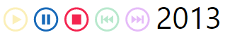
- You make your entire report animate across the Play Axis attribute.
- Animation controls available to you: looping, auto play, and the control of the play speed.

In this Play Axis the rest of the report is animated by years.
- Under the Format paintbrush there are a several customization available for the Play Axis.
- Under the Animation Settings section you can change control the play functionality of the Play Axis. Here you can make the animation automatically start, continue looping and change the speed at which the animation occurs.

- The Colors section allows you to change the modify the appearance of the Play Axis visual. You can adjust the overall color of it or make each button a different color by turning on Show all.

- The Enable Caption On section allows you to turn on/off the text displayed next to the visual or just adjust the formatting of it.

In addition to these properties you have a set of settings that appears on every visual to adjust the background color, add a border around the visual and lock the aspect ratio.
Find Out More
You will always be able to find this video module and advanced viewing of future modules on the Pragmatic Works On Demand Training platform. Click here to learn more about this training platform that includes 30+ courses.
Catch up on all the Power BI Custom Visuals blog posts here.

I love your series about custom visuals!!
Do you know if we can use more than one play axis visual in one single report?
I would like to see a sales report by month and by store by adding 1 play axis that cycles the months and another one that cycles the stores and they should work like this:
When I play start the month of January is displayed and then I see NY store, then LA store and then Miami store.
Then it goes to February and again it displays first NY store, then LA store and then Miami store.
Then it’s March and so on…
Again thank you!
Roberto
Hi Roberto. So I gave this a try and it looks like you can have two Play Axis, BUT you can’t play them both at the same time. When you start the second play axis it remove the filter of the first.
This is a great visual, trying to utilize it in a dashboard now but I have a question about the Date under the “Enable Caption” Settings.
I have my date currently formatted as (MMMM, yyyy). When the caption is turned on, the date shows “Day of Week/Month/Day/Year Time/Time Zone). I’ve tried changing it to date hierarchy, changing the date format but the animation keeps show the as described format for some reason….any idea? thank you!!
That’s interesting. Sounds like you’ve done the already what I would have suggested. It could just be a quirk of the visuals.