In this module you will learn how to use the Hierarchy Slicer Power BI Custom Visual. The Hierarchy Slicer visual is a great way to filter your day but within a hierarchical view of your data.
Module 51 – Hierarchy Slicer
Downloads
- Power BI Custom Visual – Hierarchy Slicer
- Dataset – Product Hierarchy Sales.xlsx
- Completed Example – Module 51 – Hierarchy Slicer.pbix
Key Takeaways
- Let’s you expand and dig into each level of you hierarchy data.
- Allows you to display a measure value at the lowest level.
- Replaces the idea using multiple regular slicers to represent what the Hierarchy Slicer does.

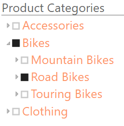
In this Hierarchy Slicer we’re showing the ability to filter down a product hierarchy.
- Under the Format paintbrush there are a few customization available for the Hierarchy Slicer.
- Under the Selection section you can choose to turn on the ability to multi-select values in the Hierarchy (by default it’s set to single select).

- The Header section allows you to change the slicer Title and adjust other formatting settings of the title.

- The Items section allows you to adjust the formatting of the hierarchy values

In addition to these properties you have a set of settings that appears on every visual to adjust the background color, add a border around the visual and lock the aspect ratio.
Find Out More
You will always be able to find this video module and advanced viewing of future modules on the Pragmatic Works On Demand Training platform. Click here to learn more about this training platform that includes 30+ courses.
Catch up on all the Power BI Custom Visuals blog posts here.
