In this module you will learn how to use the Time Brush Power BI Custom Visual. The Time Brush gives you the ability both filter your report and see a graphics representation of your data at the same time. The name Time Brush comes from the behavior used when you select the values you’d like to filter.
Module 48 – Time Brush
Downloads
- Power BI Custom Visual – Time Brush
- Dataset – Oil Production.xlsx
- Completed Example – Module 48 – Time Brush.pbix
Key Takeaways
- Combines the capabilities of a column chart with a filter.
- Highlighting or selecting a time period will automatically filter the other visuals on the report.

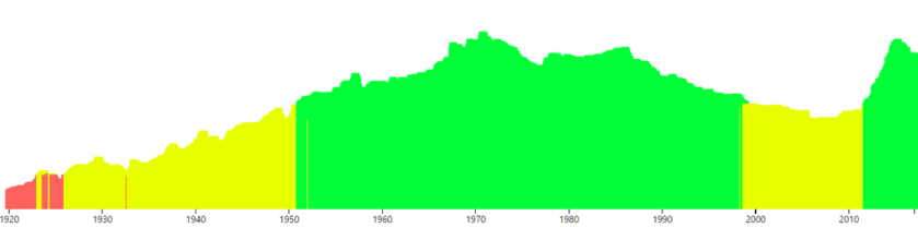
In this Time Brush the values have been categorized by low, medium, and high volume.
- Under the Format paintbrush there are several customizations available for the Time Brush.
- Under the Data Point section you can adjust the colors that are used in the Segment By field.

- In the Selection section you can turn On/Off the property called Clear selection after data changed which essentially forces you to reselect values after the data is updated in your report.

- Using the Display section you can change the Bar Width on the column chart and also reverse the bar order if needed.

- Then finally, under the Y-Axis section you can turn off the reference lines, reposition the labels, or you can turn off the Y-Axis completely.

In addition to these properties you have a set of settings that appears on every visual to adjust the background color, add a border around the visual and lock the aspect ratio.
Find Out More
You will always be able to find this video module and advanced viewing of future modules on the Pragmatic Works On Demand Training platform. Click here to learn more about this training platform that includes 30+ courses.
Catch up on all the Power BI Custom Visuals blog posts here.
