In this module you will learn how to use the Network Navigator Power BI Custom Visual. You may find the need to use the Network Navigator when you’re trying to find links between different attributes in a dataset. It does this by visualizing each attribute as a node and the strength of activity between those nodes can be represented in multiple ways.
Module 45 – Network Navigator
Downloads
- Power BI Custom Visual – Network Navigator
- Dataset – Blog Visits Network.xlsx
- Completed Example – Module 45 – Network Navigator.pbix
Key Takeaways
- Let’s you easily see the relationship between nodes.
- You may use the text search area to enlarge nodes that match your search criteria.

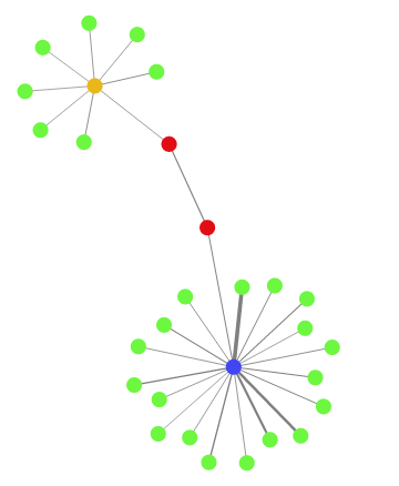
This Network Navigator show the relationship between pages on my personal website and the links between pages visited.
- Under the Format paintbrush there are several customizations available for the Network Navigator.
- Using the Search section you can adjust how the filter on this visual works. It’s a pretty simple change but here you can change whether or not your search values must be case sensitive or not.

- In the Layout section you will find the majority of settings for manipulating this visual. Let’s highlight a few of these more interesting options:
- Turning off Animate (On is the default) gives the visual a little bit less interactive feel to the visual.
- Adjusting the Max nodes allows you to determine how many maximum nodes are able to be visualized on the visual.
- Changing the Gravity property will pull the nodes close together the higher the number you provide.
- The Charge property is some what similar in the final result. Negative numbers separate nodes while positive number bring them closer together.
- Turning on the Labels property will provide a data label on each node
- While there are a few more properties listed here many of them are here for scenarios where you do not have a dataset that can automate the visual interaction.

In addition to these properties you have a set of settings that appears on every visual to adjust the background color, add a border around the visual and lock the aspect ratio.
Find Out More
You will always be able to find this video module and advanced viewing of future modules on the Pragmatic Works On Demand Training platform. Click here to learn more about this training platform that includes 30+ courses.
Catch up on all the Power BI Custom Visuals blog posts here.

Thanks much Devin. I never thought about just putting colors into the data itself so now I’m wondering how you got the HTML colors you used?