In this module you will learn how to use the Sankey Power BI Custom Visual. The Sankey is a type of diagram that visualizes the flow of data between a source and destination.
Module 28 – Sankey
Downloads
- Power BI Custom Visual – Sankey
- Dataset – Moving Regions.xlsx
- Completed Example – Module 28 – Sankey.pbix
Key Takeaways
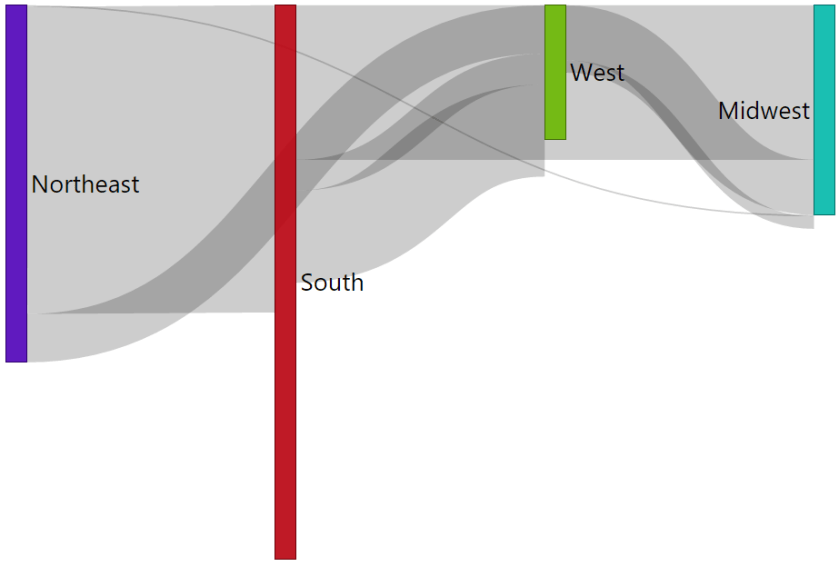
- The Sankey allows visualize data movement or flow between between two entities.

This Sankey visualizes people moving from one region of the country to another.
- Under the Format paintbrush there several options available for customizing the Sankey.
- Under the Data labels section you can define turn on or off data labels for the diagram. This section also allows you to adjust the size and color of your data labels.

- Next, you will find the Links section which defines the color that should be displayed on the linked line between each values on the diagram. In the example below they are all the default black but you can easily change these by selecting the dropdown next to each flows path.

In addition to these properties you have a set of settings that appears on every visual to adjust the background color, add a border around the visual and lock the aspect ratio.
Find Out More
You will always be able to find this video module and advanced viewing of future modules on the Pragmatic Works On Demand Training platform. Click here to learn more about this training platform that includes 25+ courses.
Catch up on all the Power BI Custom Visuals blog posts here.

One comment