In this module you will learn how to use the Gantt Power BI Custom Visual. Using the Gantt chart you can easily visualize project timelines and deliverable completion.
Module 43 – Gantt
Downloads
- Power BI Custom Visual – Gantt
- Dataset – Project Progress.xlsx
- Completed Example – Module 43 – Gantt.pbix
Key Takeaways
- Has the ability to display a “Today” line. Indicating the current date in relation to the project schedule.
- Allows you to show duration of a task as well as the percentage complete.

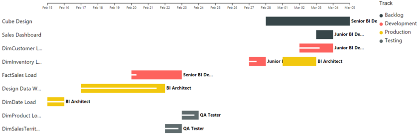
This Gantt chart shows different each task of a project, who is currently working that task, and what stage it is in the process.
- Under the Format paintbrush there are several customizations available for the Gantt chart.
- Using the General section you can choose Group Tasks, which will group any tasks with the same name together. By default their separated by tasks and by the Legend.

- In the Legend section you can change the position and attribute of the legend text (size, color, etc..).

- The Category Labels is the text on the left hand side of the chart. By modifying this section you change the color or size of the text and adjust the width this part of the chart is allotted.

- Under the Task Completion section you can control what color the % Completion field is shown as.

- Using the Data Labels properties you can adjust how the data labels are visualized on the chart.

- Finally, the Gantt Data type section you can adjust the granularity that this chart is displayed as.

In addition to these properties you have a set of settings that appears on every visual to adjust the background color, add a border around the visual and lock the aspect ratio.
Find Out More
You will always be able to find this video module and advanced viewing of future modules on the Pragmatic Works On Demand Training platform. Click here to learn more about this training platform that includes 25+ courses.
Catch up on all the Power BI Custom Visuals blog posts here.

Thanks for the video. I was just wondering what I should do if I need to make a Gantt chart available for Date Time consumption? I know tableau allows you to do this but it looks like event level data is not applicable to the Power BI chart. Would editing the custom code be one option? I know there are R visuals but from my understanding those will not display on the web. Any advice would be awesome! Thanks.
Hi Josh. Yeah i’m afraid your best bet for that would be doing an R visual or perhaps making your own version of the Gantt.