
In this module you will learn how to use the Force-Directed Graph Power BI Custom Visual. The Force-Directed Graph allows you to display relationships between your data in a fun and interactive way.
Module 22 – Force-Directed Graph
Downloads
- Power BI Custom Visual – Force-Directed Graph
- Dataset – Blog Visits.xlsx
- Completed Example – Module 22 – Force-Directed Graph.pbix
- Image – PersonIcon.png
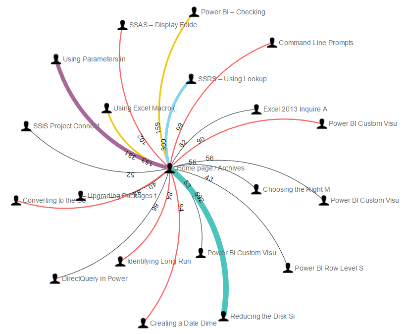
Key Takeaways
- Shows relationships between different entities in your data.
- The width of the line that separate each entity represents the strength of the relationship.

This Force-Directed Graph shows visitors to my blog and their next likely step after visiting my home page.
- Under the Format paintbrush there are several settings that allow you to customize the way data is presented in the Force-Directed Graph.
- Under the Data labels section you can you can choose to increase the text size or change the color of the text by using the Fill and Text Size properties.

- The Links property defines how the relationship lines will appear between each entity.
- Turning on the Arrow property allows you to see the direction of the relationship.
- Changing the Label property to On adds data labels on each arrow so you know the number that’s represented by the line.
- The Color property allows you to define the color of the lines dynamically based on the data.
- Turning off the Thickness property will make it so that each line is the exact same size regardless of the strength of the relationship.
- Using Display Units and Decimal Places allows you to adjust the formatting of the number that are show when the Label property is turned on.

- Under the Nodes section you can adjust the way each end point of the relationship is visualized.
- By turning on the Image property it will allow you to use an image instead of the default representation of an entity.
- In this example we used the following Image url to modify what an entity is represented as: https://file.ac/j9ja34EeWjQ/PersonIcon.png

- Adjusting the Charge property under the Size section allows you to adjust the amount of space that the visual takes up on the design surface.

- In addition to these properties you have a set of settings that appears on every visual to adjust the background color, add a border around the visual and lock the aspect ratio.
Find Out More
You will always be able to find this video module and advanced viewing of future modules on the Pragmatic Works On Demand Training platform. Click here to learn more about this training platform that includes 25+ courses.
Catch up on all the Power BI Custom Visuals blog posts here.
